A bottle label has only a few seconds to make an impression. People may see it on a conference table, in a hotel room, at a gym, or in a welcome kit, often while moving between activities. The best custom water labels are therefore simple, legible, and memorable-not crowded with design elements.
A practical label does three things: it identifies the brand quickly, communicates essential information clearly, and gives the viewer a reason to remember or act. Colour contrast, logo placement, typography, QR-code design, and required information all contribute to that outcome.
Prioritise Contrast
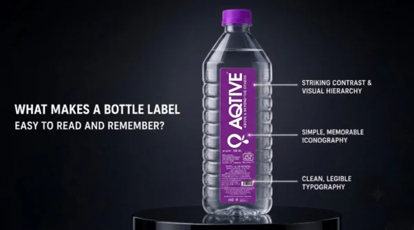
Contrast is the foundation of readable label design. The text must stand out clearly from its background, especially because bottles are often viewed at arm’s length, in bright event lighting, or through condensation.
Dark text on a light background, or light text on a dark background, is usually easier to read than low-contrast combinations. Avoid placing pale grey text on white, dark blue on black, or bright colours that visually compete with one another.
Test the design by viewing it from about one metre away. If the brand name, key message, or call to action is difficult to distinguish, increase the contrast or simplify the layout.
Colour can create recognition, but it should support readability rather than replace it. Use one or two dominant brand colours and reserve brighter accents for a logo, border, QR code, or short call to action.
Place the logo deliberately
The logo should be one of the first elements the eye notices, but it does not need to dominate the entire label. A clean, well-positioned logo is more memorable than an oversized mark squeezed among competing details.
For a standard water bottle, place the logo in the upper or central portion of the label, where it remains visible when the bottle is held naturally. Ensure it is not distorted, cropped, or obscured by the bottle curve.
Keep clear space around the logo. This “breathing room” helps the mark read as intentional and premium. If the logo includes fine details, simplify it for the small label format rather than shrinking it until it becomes unclear.
Use typography carefully
Typography affects both readability and brand personality. Choose a clean, highly legible typeface for the company name and any important message. Decorative fonts may suit a logo, but they can become difficult to read when printed small or viewed on a curved surface.
Limit the label to two typefaces at most: one for the brand name and one for supporting information. Use size hierarchy to guide the eye-largest for the brand or main message, medium for a benefit or call to action, and smaller for required details.
Avoid long sentences. Short phrases such as “Pure still water,” “Scan for menu,” or “Refill. Recycle. Repeat.” are easier to absorb than paragraphs. Ensure letter spacing is comfortable and that text does not run too close to the label edge.
Design QR codes for use
A QR code can add value by linking to a website, menu, booking page, event schedule, sustainability information, or promotional offer. However, it should never compromise the readability of the main label.
Make the QR code large enough to scan easily from a normal holding distance. Use high contrast, keep the surrounding area clear, and avoid placing it across a curved section of the bottle where it may distort.
Always test the code on multiple phones before printing. Include a short instruction beside it, such as “Scan to view the menu” or “Scan for event details,” so people understand why they should scan.
Avoid using more than one QR code unless there is a strong reason. Multiple codes create confusion and reduce the likelihood that either will be used.
Include required information
Custom water labels may need to display product and regulatory information depending on the country, bottle type, and sales channel. Confirm requirements with the bottler, label printer, or local authority before finalising artwork.
Typical information can include the product name, water type, volume, ingredients or source details where applicable, batch or best-before information, storage guidance, and manufacturer or distributor details. Do not treat this information as an afterthought; it should be legible and properly positioned.
Required details should not overwhelm the design. Use a clean information panel, smaller but readable type, and sufficient spacing so the label still looks professional.
Keep the message focused
The most memorable labels usually communicate one clear idea. A hotel may emphasise refreshment and local provenance. A gym may highlight hydration and performance. A corporate event may focus on the event name, dates, and a welcoming message.
Resist the temptation to include every service, award, slogan, and contact detail. A focused label is easier to understand, more attractive on a table, and more likely to be remembered.
Before approving the final artwork, review it in real conditions: hold a sample bottle, place it beside other drinks, view it from a distance, and test the QR code. A label that remains clear in those situations will do far more for brand recall than one that merely looks detailed on a computer screen.